NYC Neighborhood Clustering by Crime Type
Documentation in progress..
Github: https://github.com/KhokiBernier/NYC-Neighborhood-Clustering/blob/main/NYC%20Neighborhood%20Clustering%20EDITED.ipynb
Project Overview
Clustered New York City nieghborhoods by crime type per 1,000 residents and neighborhood population using K-Means algorithm in Python and visualized data in Tableau
Libraries used:
- pandas
- numpy
- matplotlib
- seaborn
- sklearn
- plotly
- statistics
Links
- NYC Arrest dataset: https://data.cityofnewyork.us/Public-Safety/NYPD-Arrest-Data-Year-to-Date-/uip8-fykc
- NYC Neighborhood by population file: https://data.cityofnewyork.us/City-Government/New-York-City-Population-By-Neighborhood-Tabulatio/swpk-hqdp
- NYC Neighborhood Coordinates: https://data.cityofnewyork.us/City-Government/Neighborhood-Tabulation-Areas-NTA-/cpf4-rkhq
- NYC Map to verify Midtown South: https://maps.nyc.gov/crime/
- US Crime Statistics 1: https://ucr.fbi.gov/crime-in-the-u.s/2012/crime-in-the-u.s.-2012/tables/29tabledatadecpdf
- US Crime Statistics 2: https://www.bjs.gov/index.cfm?ty=datool&surl=/arrests/index.cfm#
Steps Taken
- Download and format data files
- Feature Engineering
- Outlier Analysis
- Clustering
- Create Tableau Viz
All code can be found on github (linked above)
Step 1: Download and format data files
import pandas as pd
import statistics
import numpy as np

#dataframe with coordinates
df_coordinates = pd.read_csv('nynta.csv')
#dataframe with population counts
nyc_pop_data = pd.read_csv('NYC Population Data.csv')
#dataframe with crimes
df_crime = pd.read_csv('NYPD_Arrests_Data__Historic_.csv')

df_crime.ARREST_DATE = pd.to_datetime(df_crime.ARREST_DATE)
df_crime = df_crime[df_crime.ARREST_DATE.dt.year >= 2017]

df_crime.Latitude = df_crime.Latitude.astype(float)
df_crime.Longitude = df_crime.Longitude.astype(float)

df_crime.Latitude = df_crime.Latitude.replace([np.inf, -np.inf], np.nan)
df_crime.Longitude = df_crime.Longitude.replace([np.inf, -np.inf], np.nan)

df_crime.Latitude = df_crime.Latitude.dropna()
df_crime.Longitude = df_crime.Longitude.dropna()

df_crime.Latitude.isna().any()
Step 2: Feature Engineering
The following features were added:
- Crime Grouping
- Neighborhood Population
- Crimes Per 1,000 Population
- Neighborhood Center Coordinates (Note: This feature is for Tableau Visualization)
- Neighborhood Boarder Coordinates (Note: This feature is for Tableau Visualization)
Step 3. Outlier Analysis
Because the K-Means algorithm uses the mean of clusters, it’s sensitive to outliers and does not perform well with them. Additionally, I’d like to have more meaningful clusters, and our outlier data seems to be of more or less the same variety - very high crime neighborhoods. I decided to group these outliers into 1 ‘High Crime’ cluster, then create a dataset that excludes these neighborhoods and re-run the K-Means algorithm. Outliers accounted for 5 out of 193 (~2.5%) of our neighborhood population.
Step 4. Clustering
Clustering is a form of unsupervised exploratory analysis that aims to segment data based on similar traits. In our case, we a used k-means clustering algorithm, where the number of clusters (K) is specified prior to clustering. In K-Means clustering, k (the selected number of clusters) centroids are chosen as random data points. Our data points are then taken and assigned to the nearest centroid based on Euclidean distance. Once all data points are assigned to a centroid, the mean of each cluster is calculated and determined to be the new centroids. All data points are then reassigned to the nearest new centroid value. This process continues until the data points stop changing clusters, and once this occurs the total variation amongst points in the clusters is then calculated. This entire process is repeated x amount of times and the sequence with the lowest variation is used to cluster the data.
The clusters are described as follows:
- Low Crime: Low Population (69 Neighborhoods)
- Low Crime: High Population (33 Neighborhoods)
- Medium Crime: Mid Population (59 Neighborhoods)
- High Violent/Theft, Medium Traffic: Mid Population (25 Neighborhoods)
- High Crime: Low Population (2 Neighborhoods)
- Extremely High Crime: Extremely Low Population (4 Neighborhoods)
Here we have some clusters around degrees of crime and population, and some insight into neighborhoods with high violence and theft with mid level traffic crime. However, it does appear that generally when 1 type of crime is high in a neighborhood all types of crime are high as well. While that in itself is a bit of a relevation, particuralry with types of crime such as traffic, if the data set variables were less linear K-Means clustering could output more interesting clusters.
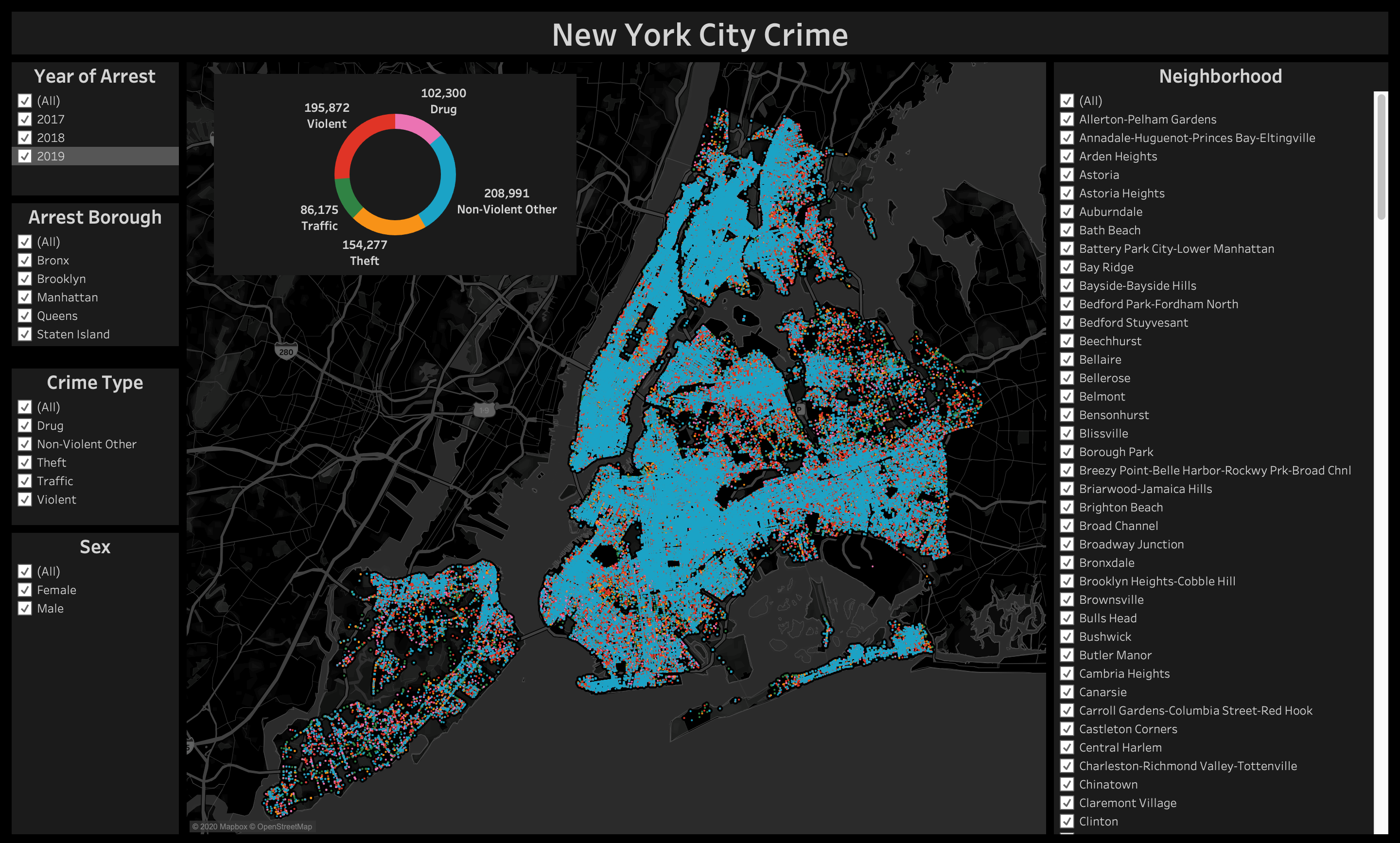
Step 5. Create Tableau Viz
Here’s another dashboard I created with just the crime data.