NYC Latin/Hispanic Population Breakdown
Project Overview
Visualize and detail NYC Latin/Hispanic Neighborhood population by nationality.
NYC Neighborhoods Latin Population Breakdown
White
Dark
Motivation
- A lof of latin/hispanics immigrate to New York City and not all are able to speak English. Living in a neighborhood with people from your country can help with the transition and assimilation into a new country while also making you feel at home.
- I’ve always considered moving to New York City and would like to live in a Spanish speaking area
- Cultures between Spanish speaking countries can differ vastly, so breaking down latin/hispanic into nationality is more helpful
Libraries Used:
- pandas
- statistics
Links to Datasets:
- Latin/Hispanic Breakdown: https://www1.nyc.gov/site/planning/planning-level/nyc-population/american-community-survey.page
- NYC Neighborhood Coordinates: https://data.cityofnewyork.us/City-Government/Neighborhood-Tabulation-Areas-NTA-/cpf4-rkhq
Steps taken:
- Pivot Latin/Hispanic breakdown dataset so that it can better analyzed in Tableau
- Clean MULTIPOLYGON column and obtain avg latitiude and longitude for each neighborhood from coordinates dataset
- Reformat Data in Order to Visualize in Tableau
Step 1. Pivot Latin/Hispanic breakdown dataset so that it can better analyzed in Tableau
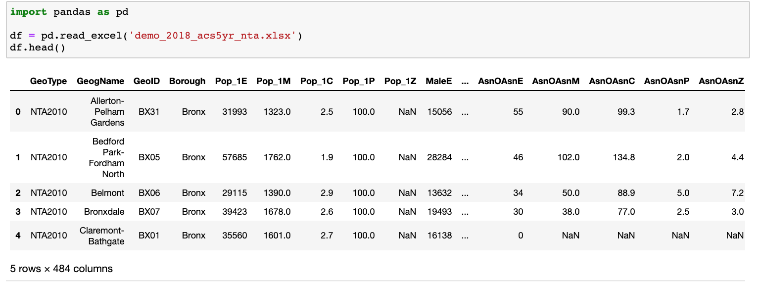
The original dataset has 484 columns with confusing headers, so the first step was to identify the columns we need and then rename them.
df.rename(columns = {
    'GeogName': 'Neighborhood',
    'Pop_1E': 'Total Population',
    'Hsp1E': 'Total Hispanic/Latino',
    'HspMeE': 'Mexican',
    'HspPRE': 'Puerto Rican',
    'HspCubE': 'Cuban',
    'HspDomE': 'Dominican',
    'HspCAmE': 'Central American',
    'HspCRE': 'Costa Rican',
    'HspGuatmE': 'Guatemalan',
    'HspHndM': 'Honduran',
    'HspNicE': 'Nicaraguan',
    'HspPanE': 'Panamanian',
    'HspSalvE': 'Salvadoran',
    'HspSAmE': 'South American',
    'HspArgE': 'Argentinean',
    'HspBolE': 'Bolivian',
    'HspChlE': 'Chilean',
    'HspColE': 'Colombian',
    'HspEcE': 'Ecuadorian',
    'HspPrgE': 'Paraguayan',
    'HspPeruE': 'Peruvian',
    'HspUrgE': 'Uruguayan',
    'HspVnzE': 'Venezuelan',
    'HspOthE': 'Total Other Hispanic/Latino',
    'HspSpnrdE': 'Spaniard',
    'HspSpnshE': 'Spanish',
    'HspSpAmE': 'Spanish American',
    'HspAllOthE': 'Other Hispanic/Latino'
}, inplace=True)

df_lap = df[['Neighborhood','Borough','GeoID','Total Population','Total Hispanic/Latino','Mexican','Puerto Rican','Cuban','Dominican',
'Central American','Costa Rican','Guatemalan','Honduran','Nicaraguan','Panamanian','Salvadoran','South American',
'Argentinean','Bolivian','Chilean','Colombian','Ecuadorian','Paraguayan','Peruvian','Uruguayan','Venezuelan',
'Total Other Hispanic/Latino','Spaniard','Spanish','Spanish American','Other Hispanic/Latino']]
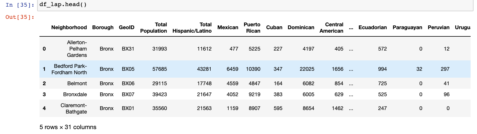
Our new dataframe has 31 columns with much more intuitive headers. This’ll make performing analysis much easier.
The next step is to transpose/pivot the data. Right now we have each Nationality (28 total) as it’s own column, and our 195 neighborhoods as all our rows. After we transpose/pivot the data we’ll remove each specific nationality column (Dominican, Guatemalan, etc), and replace it with 1 ‘Nationality’ column. We’ll keep our 195 neighborhood rows, and have 195 neighborhood times 28 nationalitys per neighborhood = 5460 rows. The purpose of doing this is that it’ll allow us to perform more advanced analysis and aggregations/filtering in Tableau.
#Dropping GeoID and Borough (we'll re-add later) and switching Nationalities to rows and Neighborhoods to columns
df_la_t = df_la.drop(['GeoID','Borough'],axis=1).T
df_la_t.index = df_la_t.index.rename('Nationality')
#Replacing numeric column indexes with Neighborhood indexes
df_la_t.columns = df_la_t.iloc[0]
df_la_t = df_la_t[1:]
df_la_t
Results in the following:
![]()
Next, I looped through the dataframe columns (Neighborhoods) and nested a loop through each nationality (index) and value (values)
#Declaring a dataframe that we will aggregate our results into
df_la_pivoted = pd.DataFrame()

for col in df_la_t.columns:
    #Creating a placeholder dataframe and setting Nationality column equal to Nationality indexes
    df_col_neighborhood['Nationality'] = df_la_t[col].index
    #Creating and setting Neighborhood equal to Neighborhood being looped through
    df_col_neighborhood['Neighborhood'] = col
    #Creating and setting Population equal to values
    df_col_neighborhood['Population'] = df_la_t[col].values
    #concatenating an aggregate dataframe with each neighborhood as they get looped through
    df_la_pivoted = pd.concat([df_la_pivoted,df_col_neighborhood],axis=0)
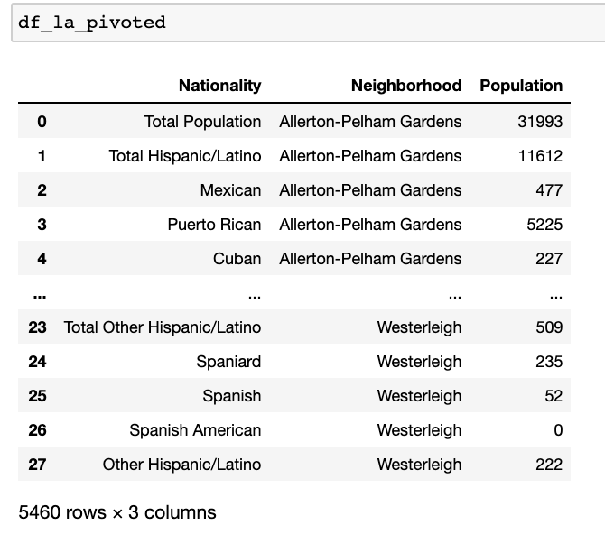
We see 5,460 rows, which matches what we were expecting. We can now merge it to our original dataframe to bring back the ‘Borough’ and ‘GeoID’ columns
df_la_pivoted = pd.merge(df_la_pivoted, df_la[['Neighborhood','GeoID','Borough']], how = 'inner',left_on=['Neighborhood'],right_on=['Neighborhood'])
Step 2. Clean MULTIPOLYGON column and obtain avg latitiude and longitude for each neighborhood from coordinates dataset
While our dataset is complete enough to analyze in Tableau, I wanted to be able to plot out the neighborhoods on a map and in order to do so we need the coordinates of each Neighborhood. The NYC Neighborhood Coordinates dataset has the exact same Neighborhood format and number as our Latin Population Breakdown (this is rare and very lucky), so we can easily just merge the dataframes on the Neighborhood column. However, the coordinates for each neighborhood are just 1 row containing a long string value (column name = the_geom):
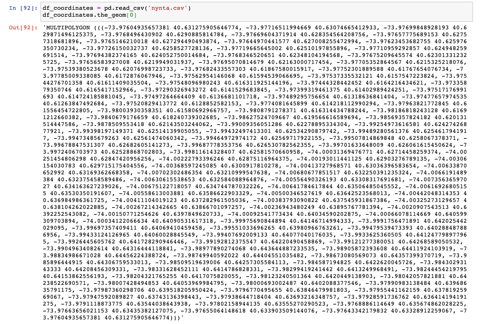
We’ll need to write a script to extract the coordinate values because I don’t believe Tableau will be able to read this format.
When doing this, I first try to identify patterns in the data that can be taken advantage of. We see that each pair of coordinates starts with a negative sign, is seperated by a space, and ends with a comma. Based on geography we are sure that each coordinate pair will start with a negative sign, so we can use this to form our script. We can also remove the text ‘MULTIPOLYGON ‘ as well as the parantheses.
import statistics
#Lists where our latitude and longitude final values will be appended
lat_list = []
long_list = []
#Loop through each row in column
for a in df_coordinates.the_geom:
    coordinates = []
    v=''
     #looping through each character in the string and removing unecessary text
    for i in a.replace(', -',',-').replace('MULTIPOLYGON ','').replace('(','').replace(')',''):
        #add the characters to the coordinate variable
        v = v+i
        #a space seperates the values in coordinates, so once we hit a space we know we completed the value
        if i == ' ':
            #setting value 1 = v
            v1=v
            #resetting v
            v = ''
        #a comma seperates the pairs of coordinates, so if we hit a comma we know our coordinate pair is complete
        if i == ',':
            #setting value 2 = v and remove the comma
            v2=v.replace(',','')
            #reset v
            v=''
            #Append the coordinates as a coordinate pair into our 'coordinates' list
            coordinates.append((v1,v2))
    #Creating latitude and longitude lists to append our coordinates into
    latitude = []
    longitude = []
    ctr = 0
    #loop through coordinates and append latitude and longitude
    for i in coordinates:
        latitude.append(i[1])
        longitude.append(i[0])
    #convert longitude values to floats
    longitude_float = []
    for i in longitude:
        longitude_float.append(float(i))
    #convert latitude values to floats
    latitude_float = []
    for i in latitude:
        latitude_float.append(float(i))
    #Get the mean longitude and latitude of the coordinate pairs (Explanation on why we want the averages below)
    lat = statistics.mean(latitude_float)
    long = statistics.mean(longitude_float)
    #append final values to our final lists
    lat_list.append(lat)
    long_list.append(long)

df_coordinates['Latitude'] = lat_list
df_coordinates['Longitude'] = long_list

for ind, lat in df_la[['Latitude']].itertuples(index=True):
    val = df_coordinates[df_coordinates.NTACode == df_la.iloc[ind].GeoID]['Latitude'].values[0]
    df_la.loc[ind, 'Latitude'] = val

for ind, long in df_la[['Longitude']].itertuples(index=True):
    val = df_coordinates[df_coordinates.NTACode == df_la.iloc[ind].GeoID]['Longitude'].values[0]
    df_la.loc[ind, 'Longitude'] = val
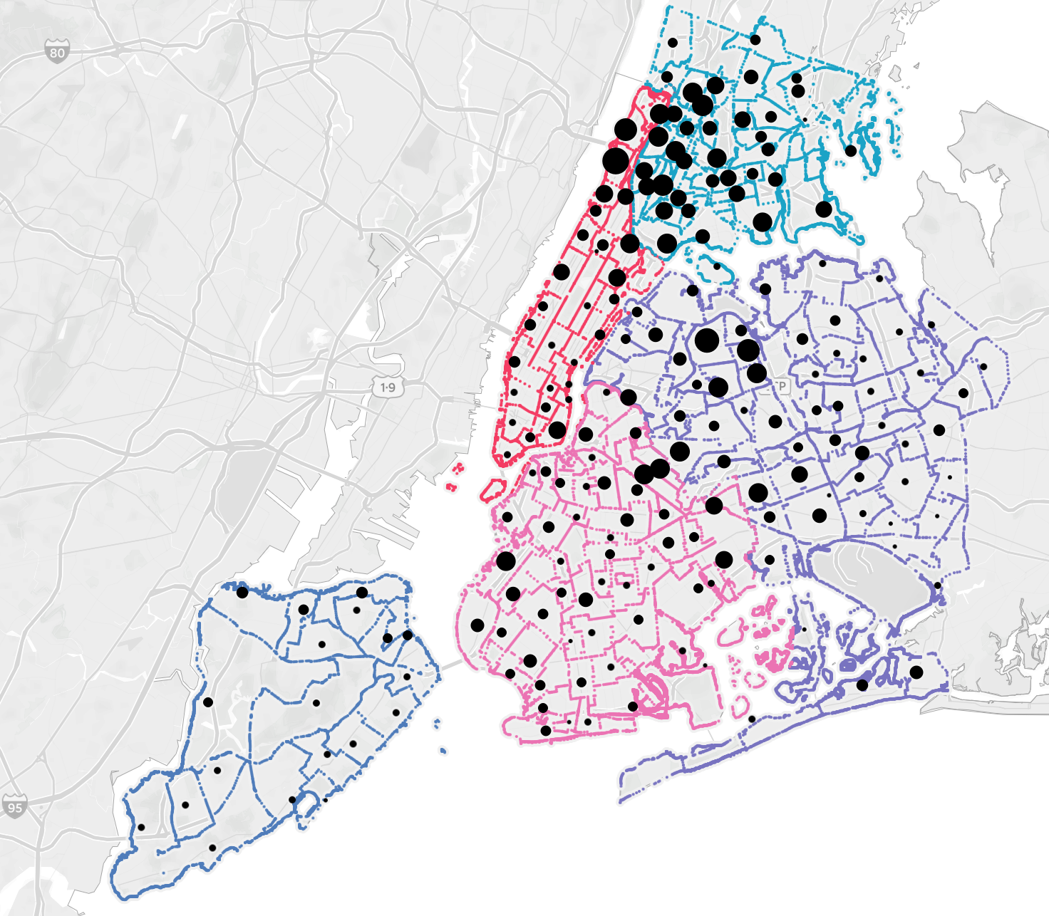
The reason we want the averages of the coordinates is because the coordinate pairs for each neighborhood are the coordinates of the boarders. Getting the average of the boarder coordinates will plot the neighborhood point in roughly the middle of the neighborhood, making it easy to distinguish between neighborhoods. Another issue for us is that there are too many coordinate pairs (3 million+ rows total) and the file is too large for tableau to handle, even when saved as a CSV. This is illustrated by the screenshots below:
Tableau with Neighborhood Boarders only:
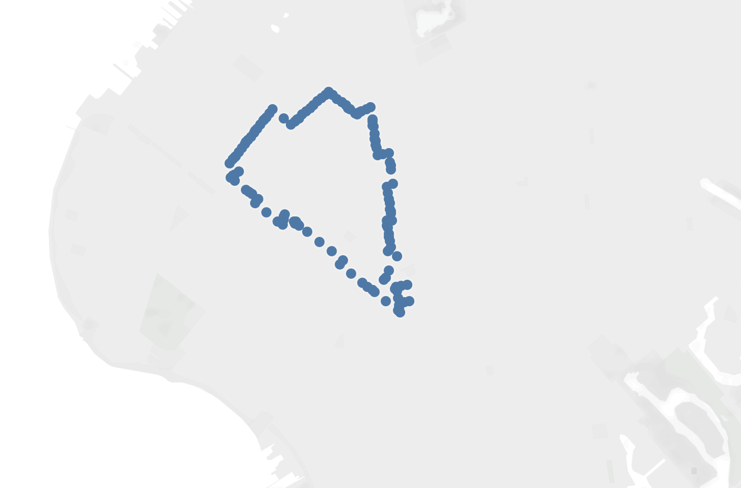
Tableau with Neighborhood Avg only:
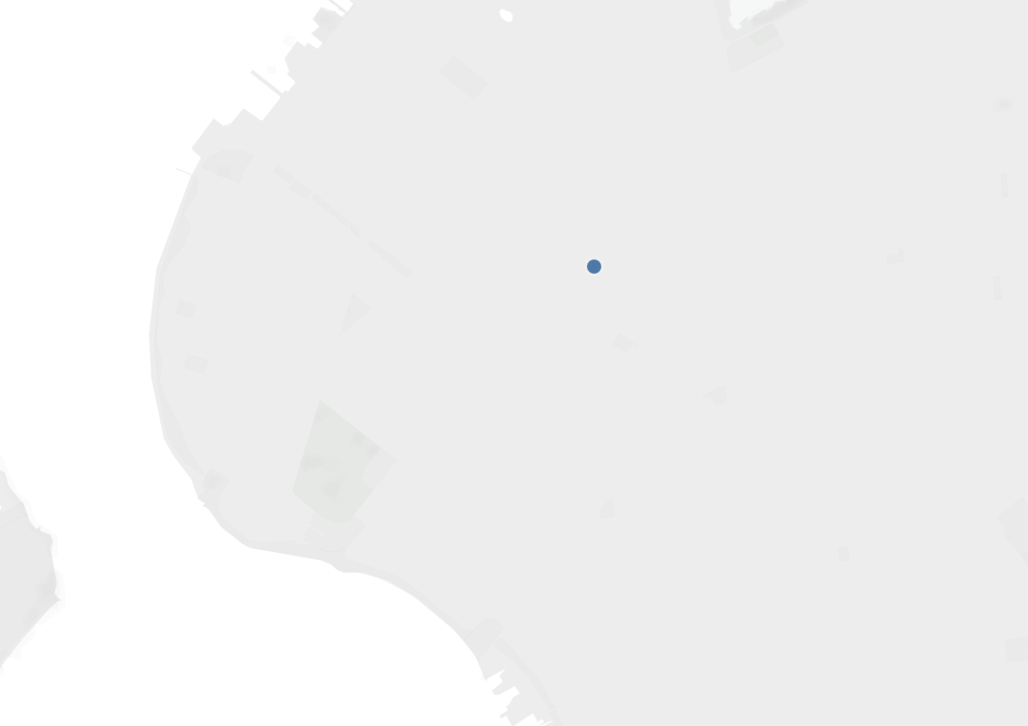
Tableau with Neighborhood Boarders and Avg (Avg is in red):
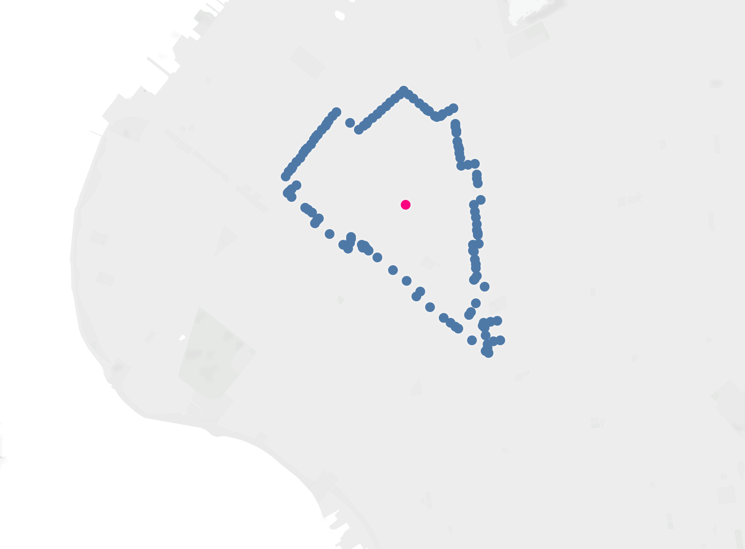
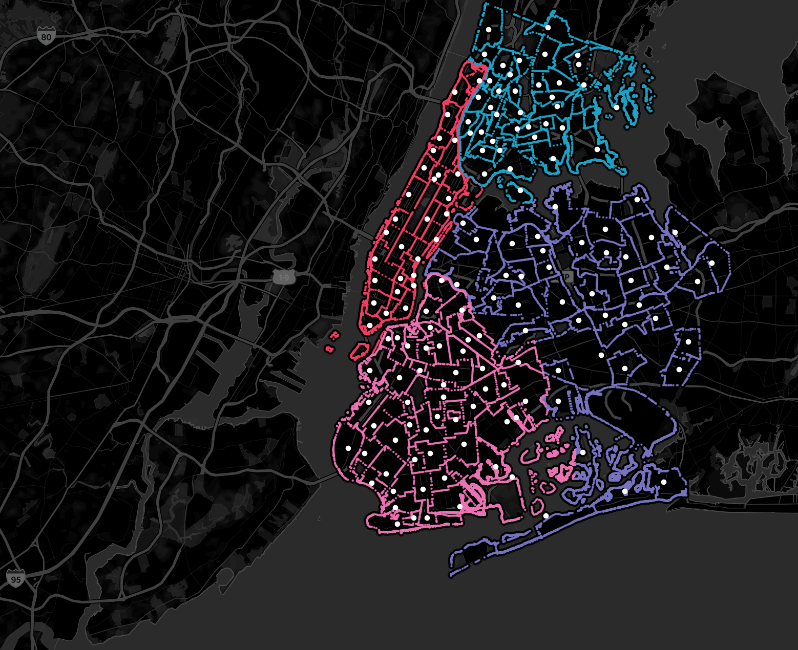
Tableau when I tried to load all boarders in. Color seperated by borough and white dot in neighborhood avg lat/long (only about 2.4 million out of 3.15 million rows made it into Tableau, so part of Queens and all of Staten Island is missing)
What I did was take the number of rows Tableau can handle from our csv (2.4 million) and subtract that from the total amount that we have 3.15 million (3.15M - 2.4M = .715M). So we need to get rid of about 25% of our coordinates. I then wrote a script to remove 1 out of every 4 coordinates. This difference in the visualization is not noticeable.
Adjusting the script, and using modules to exclude every 4th coordinate:
longitude_float = []
        for i in longitude:
            if ctr_long % 4 != 0:
                i = i.replace('(','')
                i = i.replace(')','')
                #longitude_float.append(float(i))
                long_list.append(float(i))
                neighbs.append(b)
            ctr_long+=1
Tableau with 25% of coordinates removed
Step 3. Reformat Data in Order to Visualize in Tableau
Now we have all the data that we need, but in order to maximize the quality and capabilities of our visualization in Tableau there were a few more steps I had to take to properly format our data. The steps were as follows:
- add a ‘Total Population’ column with the total population for our “middle” coordinate pair rows
- Set population counts for our boarder coordinate rows to be 0
- equally distribute the nationalities across all 2.4 million of our boarder coordinate rows
- concatenate both dataframes Step 3: ```python Nationalities = [‘Mexican’,’Puerto Rican’,’Cuban’,’Dominican’,’Costa Rican’,’Guatemalan’,’Honduran’,’Nicaraguan’, ‘Panamanian’,’Salvadoran’,’Argentinean’,’Bolivian’,’Chilean’,’Colombian’,’Ecuadorian’,’Paraguayan’, ‘Peruvian’,’Uruguayan’,’Venezuelan’,’Spaniard’,’Spanish’,’Spanish American’,’Other Hispanic/Latino’] nationalities_list = []
#2,366,196 divided 23 nationalities = ~102879 for a in range(102879): for b in Nationalities: nationalities_list.append(b) len(nationalities_list) nationalities_list=nationalities_list[0:2366196] df_all_coordinates[‘Nationality’] = nationalities_list
Step 4:
```python
df_nyc_concat = pd.concat([df_la_pivoted2,df_all_coordinates])
- The purpose of step 1 is to maintain our total neighborhood population when we filter by Nationality in our visualization. This allows us to keep percentage of Total population and other valuable metrics when we filter our data by Nationality
- The purpose of Step 2 is to keep our Boarder points on the visualization without having them affect the counts in our data. When performing a union (concatenating), we need the columns of both dataframes to match so here we just put a 0 so it doesn’t impact our numbers
- The purpose of step 3 is so that we keep our boarder points on the visualization when filtering by nationality. Each nationality now has around 100K+ boarder points each, and that’s enough that in Tableau that you won’t notice the difference (between 2.4 million and 100K coordinate pairs)
- Step 4 is to reduce the need for data blending in Tableau. The way Tableau mapping is set up, I was not able to plot the boarder points and “Middle” points while keeping the ‘Middle’ points dataframe as my Primary data source in the Map worksheet. As a result, the filters in the primary data source would not sync down to my secondary data source data.
Latin/Hispanic Group to NYC borough Sankey Chart
- I realize this isn’t the optimal situation for a Sankey chart, I just really wanted to make one..
- click on the group and borough boxes to highlight the flow